The website redesign process is exciting – an opportunity to give your bank’s digital branch a much-needed facelift. It offers the chance to revitalize your brand, engage with your existing customers in new ways, and grow your online visibility to capture new leads.
However, the website design process can also be daunting, and there are many steps that your team must take prior to kicking-off the design and development of a new website.
In the rapidly evolving landscape of digital banking, a user-friendly and visually appealing website is crucial for attracting new customers while providing a familiar experience to your existing customer base. As technology advances and customer expectations rise, banks often find themselves contemplating a website redesign to stay competitive and enhance the overall user experience. However, before diving into a redesign project, financial institutions must carefully consider various factors to ensure a successful and seamless transition.
Settle on a Time Frame for Launch
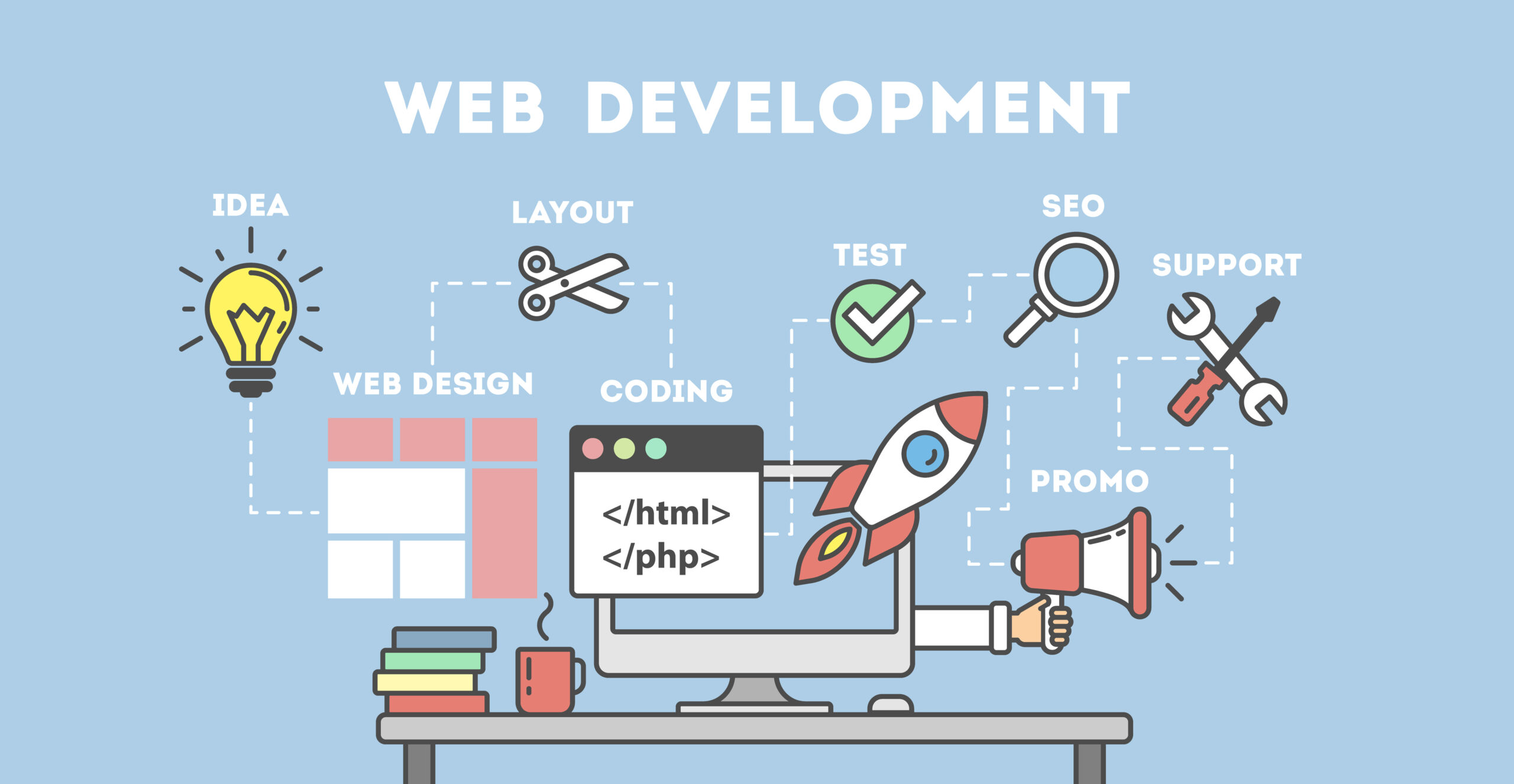
If you have a specific launch date in mind, work backwards to consider how much time will be needed to complete each phase of the process. Here are a few broad guidelines to demonstrate how much time is needed for various components of the design process:
- Copywriting | 4-6 weeks: This is dependent on the volume of content that needs to be created. If your site is relatively small, then you may be able to create content for all product pages within a few weeks. If you are planning to add new content pages to your site, then you will want to account for more time needed for copywriting. This process often happens in tandem with the design and development.
- Design | 3-5 weeks: This time frame may shift depending on the complexity of the design and the amount of feedback that is given to the designers. Sweeping changes to designs will yield a much longer design process – but sometimes this time is required to achieve a design that accurately reflects your brand. After all, your website is effectively a 24/7 branch of your bank or credit union, so you will want your web design and user experience to be simple, elegant, and easy-to-use!
- Development | 5-6 weeks: Once the design has been locked-in, the development process can begin. Be sure to communicate all of the requirements of your website to the developers prior to starting this stage of the project. This could include custom tools like calculators and chat bots. Copywriting should ideally be completed prior to starting development, so that the approved copywriting can be incorporated into the new site at this time.
- Testing & Launch | 2-3 weeks: Once the site has been developed and content is in place, the testing process begins. This ensures that the website performs the way it is expected to. The marketing team can also use this time to configure goal tracking, implement Google Analytics and similar tools, etc.
Also, be sure to communicate deadlines and desired launch dates with your designers, developers, copywriters, and marketing department so that they can work in tandem to meet those demands.

Evaluate Your Bank’s Brand Identity
A website redesign is a chance to reassert your core values and brand identity. Before you even begin the redesign process, it might be helpful to perform internal reevaluations on your brand and how your new website reflects your ideal brand identity. If you don’t have a clear idea of your current brand identity, or if you aren’t sure how to update your brand to reflect your goals, then this process is essential to help you settle on a design and write content.
Examine your core values and mission, the current state of your local market, the changing needs of your primary audience, and your brand’s persona and voice. You might want to ask yourself the following questions to guide this assessment process:
- What are our values and how do we uphold those values?
- How does our customer base view our bank brand?
- Does our brand have a distinctive voice and personality?
- How does our brand view our customer base?
- How do our deposit products and loans impact our customers?
- How should our brand make our customers feel?
- What are five words that customers would use to describe our brand?
- How does our brand communicate with customers?
Once you have outlined your current brand essence, then you can analyze your findings to address any weaknesses that you may have uncovered or update your brand to reflect your bank’s shifting goals. It is a good idea to perform this introspective analysis before starting the design or content writing, so that your marketing team, your copywriters, designers and developers are all on the same page.
Research Your Competition
Before you dive head-first into a redesign, it can be immensely helpful to take a look at your competitors in your local market and beyond. Research the financial institutions in your market and look for trends that you would like to emulate on your own site. Look at the aesthetics, fonts, usability, ease of navigation, mobile formatting, placement of conversion points, etc. Note these examples down so that you can reference them during conversations with your design team.
You can also look for weaknesses on these sites and brainstorm methods to improve upon them. Perhaps your competitors are exclusively using stock photography on their sites; this leaves an opening for you to use custom, local photography across your new website to frame your bank as a local, community-focused institution. Maybe your competitors’ websites are very light on content, giving you a distinct advantage if you are to use robust, localized content on your own site.
Identify Your Conversion Goals
When most banks think about the goals of their website redesign, they are probably hoping to increase deposit account openings, drive lending leads, and start conversations with commercial banking clients. However, it is important to be as specific as possible when identifying your goals and consider the multiple conversion points that will be built into your site to allow you to achieve those goals.
Make a list of your primary goals and consider the avenues that you can build into your site in order to help your customers funnel through to reach those conversion points. This list can be broken down into primary, secondary, tertiary, conversions. This information will help your designers and developers build these conversion points into the new site.
Let’s use a Mortgage Loan product page as an example and take a look at various conversion points that should be included on this page:
- Primary Goal: Users click a link that will take them to a loan application portal.
- Secondary Goal: Interactable contact information for mortgage lending specialists or a web form that is sent directly to the mortgage department.
- Tertiary Goal: Clickable phone numbers, links to your Contact or Locations pages.
You may also want to consider additional conversion points beyond these standard ones. Chat bots, appointment scheduling tools, etc. The more conversion points you provide, the more likely you will be to provide touch points for users in every stage of the buyer’s journey.


